Aix-en-Provence Maternity asked us to improve their visual identity, most importantly the information organisation and the navigation in the hospital.

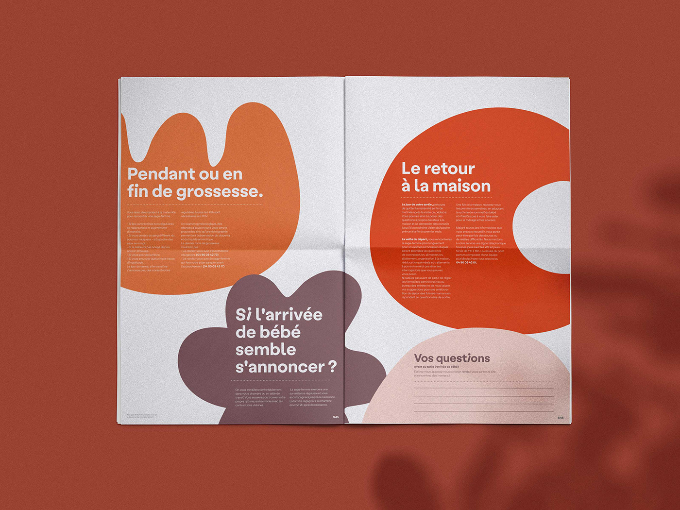
We created a vocabulary of shapes that will guide the visitors in the maternity and in all the print/ web supports. Each shape has a designated meaning and is designed to look gentle and positive.
Our color palette is inspired by the South of France (where the maternity is situated).